
(And no, I’m not talking about sales.)
Let’s be brutally honest. You’ve seen them. Beautifully designed SaaS products with stunning animations, perfect color palettes, and a landing page that looks like it belongs in a museum.
And they have zero customers.
Meanwhile, some ugly-ass app built by a solo developer with a weird logo is printing money.
What’s the difference? The ugly app probably has more “buy buttons.”
I was watching an interview with a founder, Ayush, who built a simple app to $150k a year. His advice to other founders was simple: “Put more buy buttons on the internet.”
Most people hear that and cringe. But they’re missing the point. He’s not talking about spamming your users. He’s talking about a core design philosophy that 99% of designers and founders completely misunderstand.
A “buy button” isn’t just a button. It’s any moment where a user can say “yes” to your product. It’s the point where they trade their attention, email, or money for the value you’re promising.
And most products make it ridiculously hard to say yes. Your job as a designer is to make saying “yes” the easiest, most obvious, and most trustworthy decision a user can make.
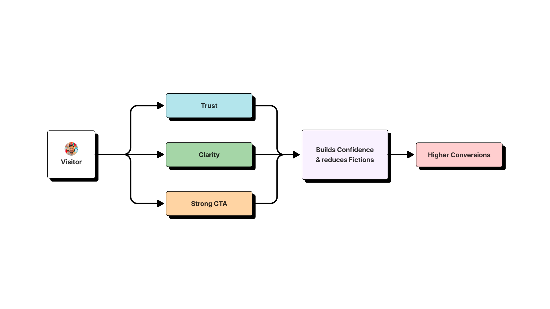
This is a design problem. And here’s the 3-part playbook to fix it.
Play #1: Declare War on Visual Distrust
A “buy button” is useless if the user doesn’t trust the page it’s on. Your first job is to forge a visual environment that screams “professional” and “legit.”
The 99% think this is about “making it pretty.” It’s not. It’s about eliminating any visual cue that makes a user’s gut clench with doubt.
Your Hit List:
- Inconsistent Spacing & Alignment: This is the #1 killer. If your margins are all over the place, it feels sloppy and untrustworthy. Be a tyrant about your grid.
- Too Many Fonts & Colors: This is the “clown car” approach to design. It screams “amateur hour.” Pick two fonts, max. A clean Workhorse for body copy (like Inter) and a Headliner with some personality for big titles. That’s it.
- Cheesy Stock Photos: Kill them. Kill them with fire. A slightly blurry photo of the actual team is 100x more trustworthy than a stock photo of smiling, multicultural business people in a boardroom that’s obviously not yours.
Play #2: Murder Friction Wherever You Find It
Friction is the enemy of the “buy button.” It’s every unnecessary click, every confusing label, and every extra form field that stands between your user and the “yes.”
I once consulted for a startup with a killer product. Their signup button was buried three clicks deep in their navigation, hidden behind a vague “Get Started” label. They thought they had a marketing problem. They had a friction problem.
Your Hit List:
- The 10-Field Form: Are you asking for a phone number, company size, and their mother’s maiden name just for a newsletter signup? You are committing a crime. For a lead magnet, ask for an email. That’s it.
- The Vague CTA: What the hell does “Learn More” even mean? Your buttons need to be a promise, not a mystery. “Get My Free Template,” “Start My 14-Day Trial,” “Request a Quote.” Be specific.
- The “Guess What’s Clickable” Game: Don’t make your users hover over every element, trying to figure out how your interface works.
Play #3: Make the Next Step an Unmissable Neon Sign
This is the literal “buy button” part of the equation. Once you’ve built trust and removed friction, you have to make the call to action impossible to miss.
Your Hit List:
- The Gray Ghost Button: I see this all the time. A beautiful, minimalist page with a primary call-to-action button that’s a light shade of gray, blending into the background. Your CTA should be the single most visually dominant, high-contrast element on the page. Make it loud.
- The “Scroll and Hope” Strategy: Your primary CTA must be “above the fold.” A user should know what you do and what you want them to do the second the page loads, without scrolling.
- The Lone Ranger: Don’t be afraid to have more than one “buy button.” If your landing page is long, repeat your CTA. One in the hero, one in the middle, and one at the bottom.
The Bottom Line
Putting more buy buttons on the internet isn’t about being a sleazy marketer. It’s about respecting your user’s time and intelligence.
It’s about having the confidence to make a clear promise, the discipline to create a trustworthy design, and the empathy to make the next step effortless.
That’s not a sales tactic. That’s a designer’s job. And if you do it right, it’s the most valuable thing you’ll ever bring to a product.


