Stepper inputs are the small buttons you see on a website or app when you need to pick a number, like choosing how many of something you want to buy. They’re important for making sure people can use websites and apps easily — a good stepper input is fast, functional, and simple.
In this article, we’re going to learn how to make a stepper input using a cool design tool called Figma (maybe you’re familiar with it!). Whether you’re already good at design or just starting, this guide will help you create a stepper input that looks great and works well.
What is a stepper input?
A stepper input is a nifty little box that pops up on your screen when you need to pick a number. It usually has a plus (+) button to increase the number and a minus (-) button to decrease it.
Why use stepper inputs?
Ever wondered why those little plus and minus buttons on websites are a big deal?
Stepper inputs make things like adjusting quantities or values super easy and quick. Imagine a box you can click to add more cookies to your order or take some away — that’s basically what a stepper input does. They’re the unsung heroes in the world of website navigation!
Step-by-step tutorial: Creating a stepper input in Figma
Step 1: Designing the basic structure
Your first task is to draw your stepper input. Imagine it as a small rectangle with two buttons on each side.
You get to pick the colors and the style of numbers that will show up in the middle. This is where you start turning your idea into a real design.
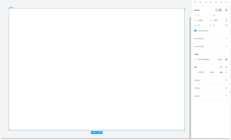
To create input steppers, start by navigating to the left side of the Figma interface. Next, select the Frame tool. Once you’ve chosen it, configure the dimensions to match your project requirements. For this demonstration, I will use a frame size of 1440 pixels in width and 960 pixels in height:

Now that we have a frame, if you would like to change the number of frames, you can do that by selecting the Frame and changing the fill color in the left sidebar. Congratulations, you now have a frame ready:
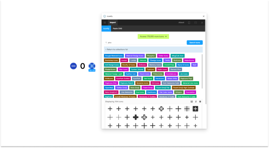
Now, let’s proceed to create the icons for “up” and “down.” This process is straightforward—you can either design these icons manually or utilize a plugin called Iconify. With Iconify, you can search through a vast library of icons.
For this article, we will search for the plus and minus icons. Simply click on one of these icons, and then import it either as an individual icon or as a component:
To adjust the number of icons and add a text element, follow these steps. Once again, navigate to the top-left menu. After you’ve placed the icon and text element, apply auto layout by pressing Shift + A.
Ensure that you have the appropriate positioning selected so that when the number increases, it automatically adjusts the spacing between the elements of the stepper input. Also, you can make changes in spacing by navigating to the left sidebar:
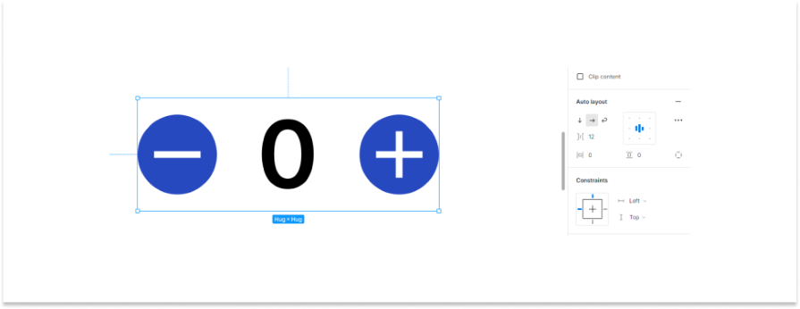
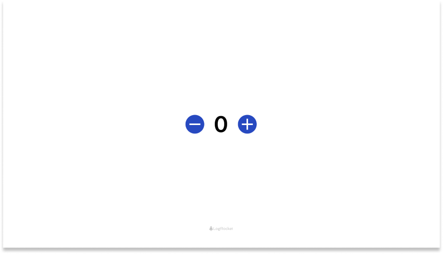
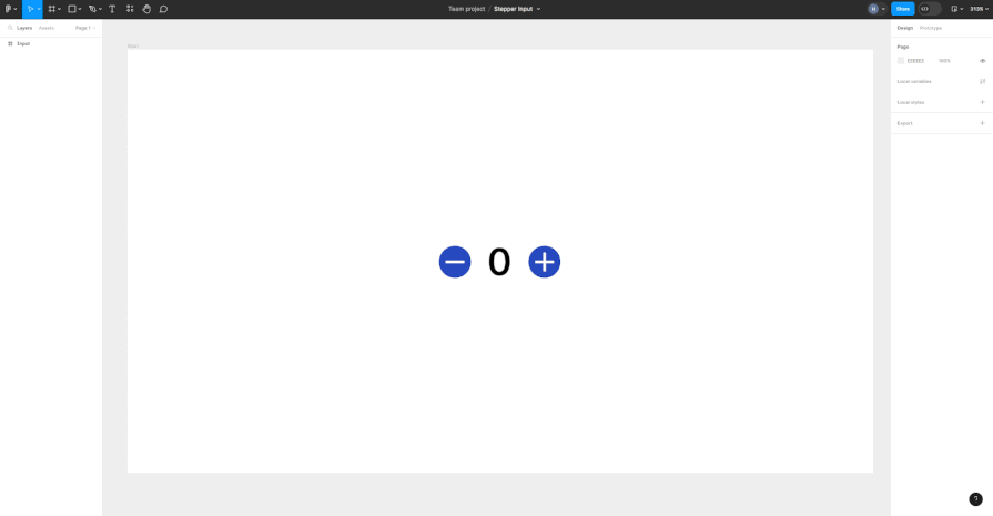
Now you have a proper stepper input design with auto layout in Figma:
Step 2: Implementing conditional logic
Here’s where things get interesting. You can set rules for your stepper input. Maybe you decide that the number can’t go below zero or above ten.
If someone tries to go beyond these numbers, the buttons will stop working. It’s like setting boundaries to make sure your stepper input works correctly.
So, we have created a basic design for a stepper input. Now it’s time we implement conditional logic behind it. Firstly we will have to create a number variable, To do this, first click on Right now and look for something called Local Variables. After you click there, a new window will pop up. In this window, you need to make a new Number variable:
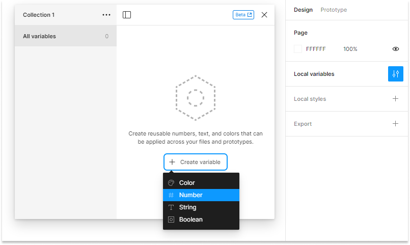
Next, give this variable a name and a value:
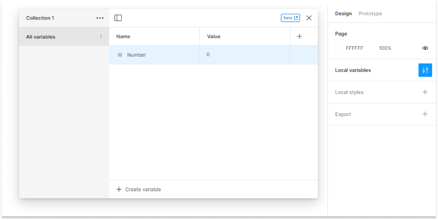
Remember, the value should be 0. Now, for the last part, you need to add this number to something else. Click on the Text Layer panel on the right side. But first, make sure you choose the number part in your design:
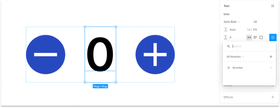
After you do this, a small box will show up. Click on it, and you’ll see all the variables you made. From there, pick the number variable you just created:
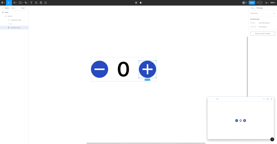
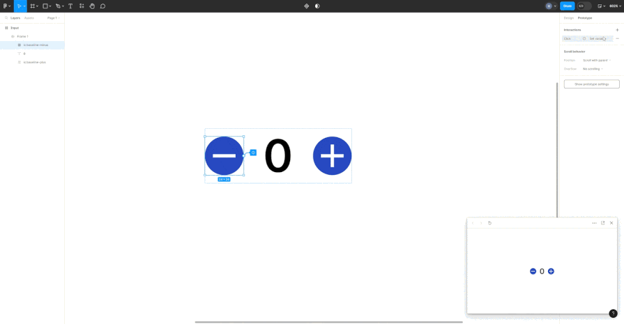
Now that we’ve got our number variable all set up, it’s time to make our plus icon do some cool stuff. Here’s how: first, head over to the top right corner in Figma and click on Prototype. Once you’re there, make sure to pick out the plus icon or whatever element you’re working with.
Next, choose the On Click option. This is where the magic happens. You’ll see an option to Set Variable. Here, you can decide whether you want to add to or subtract from your number.
So, when you tap on the plus icon, you get to choose which variable gets the boost. Just after hitting the +, pick the number you want to add, and voila! That number will be added right to your variable:
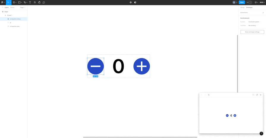
Now you can see the magic. Next, we have to do the same process with our minus icon:
You must have seen in the preview above that the numbers are appearing negative, like -1 and -2; let’s fix this using conditional prototyping.
Let’s say our number hits zero. What we want then is to put a pause on the subtract button — kind of like saying, “Nope, can’t go lower than this.” We set up this neat little rule that says, “Hey, this minus thing only works when our number is more than one.”
This is like setting up a little boundary to make sure things stay in the fun zone. Think of it as telling our design, “Okay, you can play, but only if the number is bigger than one.”
And there you have it! The basics of a stepper input. Let’s see how companies step up their stepper inputs; we may have nailed the essentials, but we’ve yet to see how useful this element can be in action.
Case studies: Mastering the art of stepper inputs
Kayak: Simplifying travel choices
Kayak totally nails it when it comes to making travel planning a breeze. They’ve cleverly used stepper inputs to let users pick how many people are jetting off, with options for various groups who can land discounted flights or fly free, like students or lap infants:
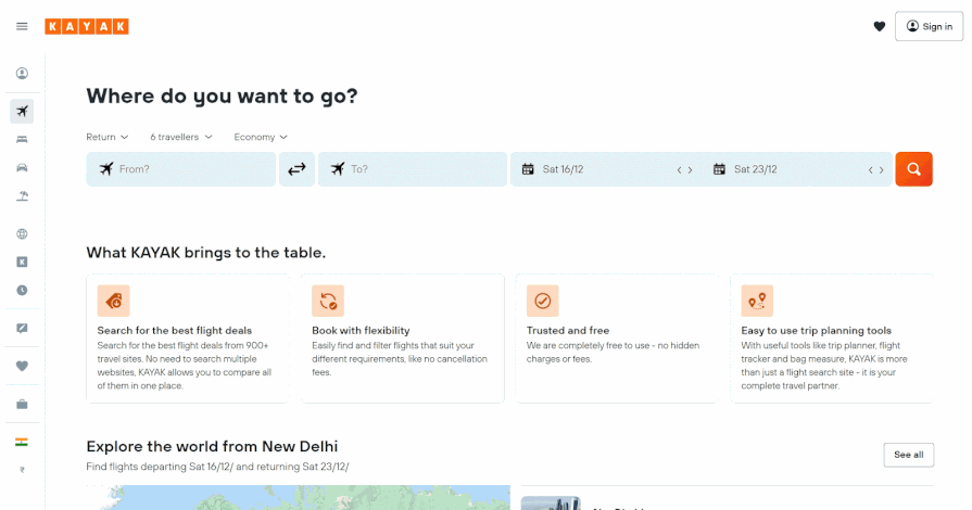
It’s like a quick tap game where each tap adds another buddy to your adventure. This approach makes choosing the number of travelers super straightforward, turning a potentially tedious task into a few fun clicks.
Expedia: Revolutionizing online travel booking
Take a virtual trip to Expedia’s website, where they’ve revolutionized the online booking experience. Picture yourself planning a holiday and needing to select hotel rooms or flights. Expedia’s website makes this a breeze with its stepper inputs, similar to Kayak with flights:

A simple click, and you’re adjusting traveller numbers or stay duration without any hassle. This simplicity is particularly handy for quick adjustments, showing how a small design element can significantly enhance the online booking process, making it straightforward and stress-free.
You may have noticed Expedia’s stepper inputs call a dropdown if you select a certain option; in this case, if you select the plus icon next to Children. This is an advanced feature you can add with conditional logic in Figma.
Booking.com: Navigating hotel reservations with ease
Let’s check into Booking.com’s website, where finding the perfect hotel room is as easy as a few clicks. Picture yourself planning a getaway and needing to sort out your stay. Booking.com’s steppers on their website make adjusting room choices and guest numbers a walk in the park:

Notice how their input stepper has different logic: you must book at least one adult. The minus option is unclickable for anything less than one adult and changes color to indicate that.
Booking.com’s approach is a testament to how user friendly web design can make planning your trips not just easy, but also a bit more fun.
Best practices for designing stepper inputs in Figma
Experiment with custom animations
Animations can bring your stepper input to life. Experiment with different animations in Figma, like having the number smoothly slide up or down as it changes. This adds a dynamic feel to the user interaction.
Use variants for different states
Figma allows you to create variants of a component for different states. You can design variants for your stepper input when it’s active, disabled, or in an error state. This helps in visualizing how the stepper behaves under different conditions.
Responsive design
Ensure your stepper input adapts to different screen sizes and resolutions. You can use Figma’s constraints and layout grids to make your design responsive, ensuring it looks great on any device.
Color and contrast for accessibility
Pay attention to color and contrast, especially for users with visual impairments. Use Figma’s color and contrast tools to check if your design is accessible to a wider audience.
Interactive prototyping
Go beyond static designs by using Figma’s prototyping features. Link your stepper input to different screens in your prototype to show how it interacts with other elements of the user interface.
Gather user feedback
If possible, test your design with real users. Gather feedback on the usability and aesthetics of your stepper input. Use this feedback to make iterations and improvements.
Innovative shapes and textures
Don’t limit yourself to traditional shapes. Experiment with circular steppers, or add textures to the background for a unique look.
Conclusion
Designing a stepper input in Figma is not only about making something look cool. It’s about creating a helpful tool that people can use easily. By following these steps, you can make a stepper input that not only looks fantastic but also makes the user’s experience better.
For more tips and tricks on Figma and stepper inputs, check out NN Group’s guidelines.
Originally published at https://blog.logrocket.com on February 7, 2024.