Theory is great, but nothing beats seeing the real thing. When it comes to understanding UX sitemaps, looking at abstract diagrams of boxes and lines can only get you so far. To truly grasp how to structure a website for a great user experience, you need to see real-world examples in action.
You’ve asked, and I’ve delivered. I’ve built dozens of sitemaps for clients in e-commerce, real estate, and SaaS at companies like White Label Resell, and I know what works. This is a practical, no-fluff guide filled with UX sitemap examples for different types of projects.
We’ll cover the fundamental structures for e-commerce sites, SaaS applications, content-heavy blogs, and corporate sites. Let’s get visual.
A Quick Refresher: What is a UX Sitemap?
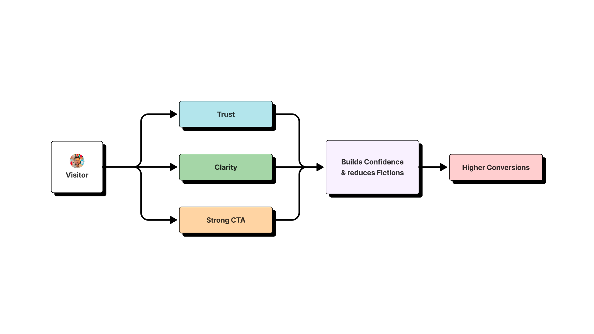
A UX sitemap (or visual sitemap) is a hierarchical diagram of your website’s pages. It’s a tool for humans, not search engines. Its primary goal is to define the site’s information architecture (IA) and structure, ensuring the user journey is logical and intuitive before a single line of code is written.
E-commerce UX Sitemap Examples (4 Examples)
For e-commerce, the sitemap must create a frictionless path from product discovery to purchase.
1. The Classic Apparel Store
- Structure: Home -> Shop -> (Men’s, Women’s, Accessories) -> Sub-categories -> Product Page. Also includes top-level links for About, Contact, and Account.
- Design Rationale: This nested hierarchy allows users to drill down to the specific product they need with minimal clicks.
2. The Single Product Brand (e.g., a high-tech coffee maker)
- Structure: Home -> Features -> Tech Specs -> Reviews -> Shop.
- Design Rationale: The sitemap builds a compelling narrative that guides the user towards a single call-to-action: “Buy Now.”
3. The Subscription Box Service
- Structure: Home -> How It Works -> Our Boxes -> Subscribe.
- Design Rationale: Focuses on explaining the value proposition and making the sign-up process as simple as possible.
4. The Digital Products Store (e.g., fonts, templates)
- Structure: Home -> All Products -> Categories (e.g., Serif, Sans-Serif) -> Product Detail -> Purchase/Download.
- Design Rationale: Optimized for browsing and quick discovery, often with a robust search function at its core.
SaaS Application UX Sitemap Examples (4 Examples)
SaaS sitemaps need to balance marketing pages (for attracting new users) with product pages (for serving logged-in users).
5. A Project Management Tool
- Marketing Site Structure: Home -> Features -> Pricing -> Blog -> Login.
- App Structure (Post-Login): Dashboard -> Projects -> Team -> Settings.
- Design Rationale: Clearly separates the “sales” experience from the “product” experience.
6. A CRM Platform
- Structure: Home -> Solutions (by industry) -> Product Tour -> Request a Demo.
- Design Rationale: Tailors the user journey to specific customer segments, showing them only the features that are relevant to their industry.
7. A Simple Utility App (e.g., a time tracker)
- Structure: A single, powerful landing page that explains the tool, shows a demo, and has a clear call-to-action to sign up.
- Design Rationale: For simple tools, a one-page marketing site can be more effective than a complex, multi-page structure.
8. Enterprise-Level Software
- Structure: Home -> Platform -> Resources (Whitepapers, Case Studies) -> Talk to Sales.
- Design Rationale: The goal isn’t direct sign-up; it’s lead generation and qualification for a high-touch sales process.
Blog & Content Site UX Sitemap Examples (4 Examples)
For content-driven sites, the goal is discovery and engagement.
9. A Personal Design Blog
- Structure: Home -> Topics (UX, UI, Case Studies) -> About Me -> Contact.
- Design Rationale: A classic, effective structure that allows users to find content by topic. This is similar to the structure of my own website.
10. A Major News Publication
- Structure: Home -> News -> Politics -> Tech -> Culture -> Subscribe.
- Design Rationale: A broad and shallow hierarchy designed to surface as much fresh content as possible on the homepage and main category pages.
11. A Niche Recipe Blog
- Structure: Home -> Recipe Index -> Courses (Breakfast, Dinner) -> Cuisines (Italian, Mexican) -> About.
- Design Rationale: Provides multiple ways for users to filter and discover recipes based on their specific needs.
12. An Online Magazine
- Structure: Home -> Features -> Columns -> Issues -> Video.
- Design Rationale: Organizes content by format and recurring segments, catering to loyal readers.
Corporate & Professional Service Website Examples (4 Examples)
These sites are built to establish credibility and generate leads.
13. A Law Firm
- Structure: Home -> Practice Areas -> Attorney Profiles -> Blog -> Contact Us.
- Design Rationale: Focuses on showcasing expertise (Practice Areas, Profiles) and building trust to encourage potential clients to make contact.
14. A Digital Marketing Agency
- Structure: Home -> Services (SEO, PPC) -> Case Studies -> About -> Request a Quote.
- Design Rationale: The entire user flow is designed to prove results (Case Studies) and guide visitors toward becoming a lead.
15. A Real Estate Brokerage
- Structure: Home -> Property Search -> Our Agents -> Neighborhood Guides -> Blog.
- Design Rationale: The sitemap prioritizes the property search tool while providing valuable content (Neighborhood Guides) to capture informational search traffic.
16. A Non-Profit Organization
- Structure: Home -> What We Do -> Get Involved -> Donate -> About Us.
- Design Rationale: Built around two primary user goals: educating the public and driving donations/volunteer sign-ups.
How to Create Your Own UX Sitemap
Inspired by these examples? Here’s a quick 5-step process to build your own:
- Conduct a Content Audit: List all the pages you have or plan to have.
- Define User Goals: What are the most important tasks users need to complete?
- Group with Card Sorting: Ask real users to group your pages logically.
- Draft the Diagram: Use a UX tool like Figma or FigJam to create the visual hierarchy.
- Test and Refine: Share it with your team and users to find gaps and improve the flow.