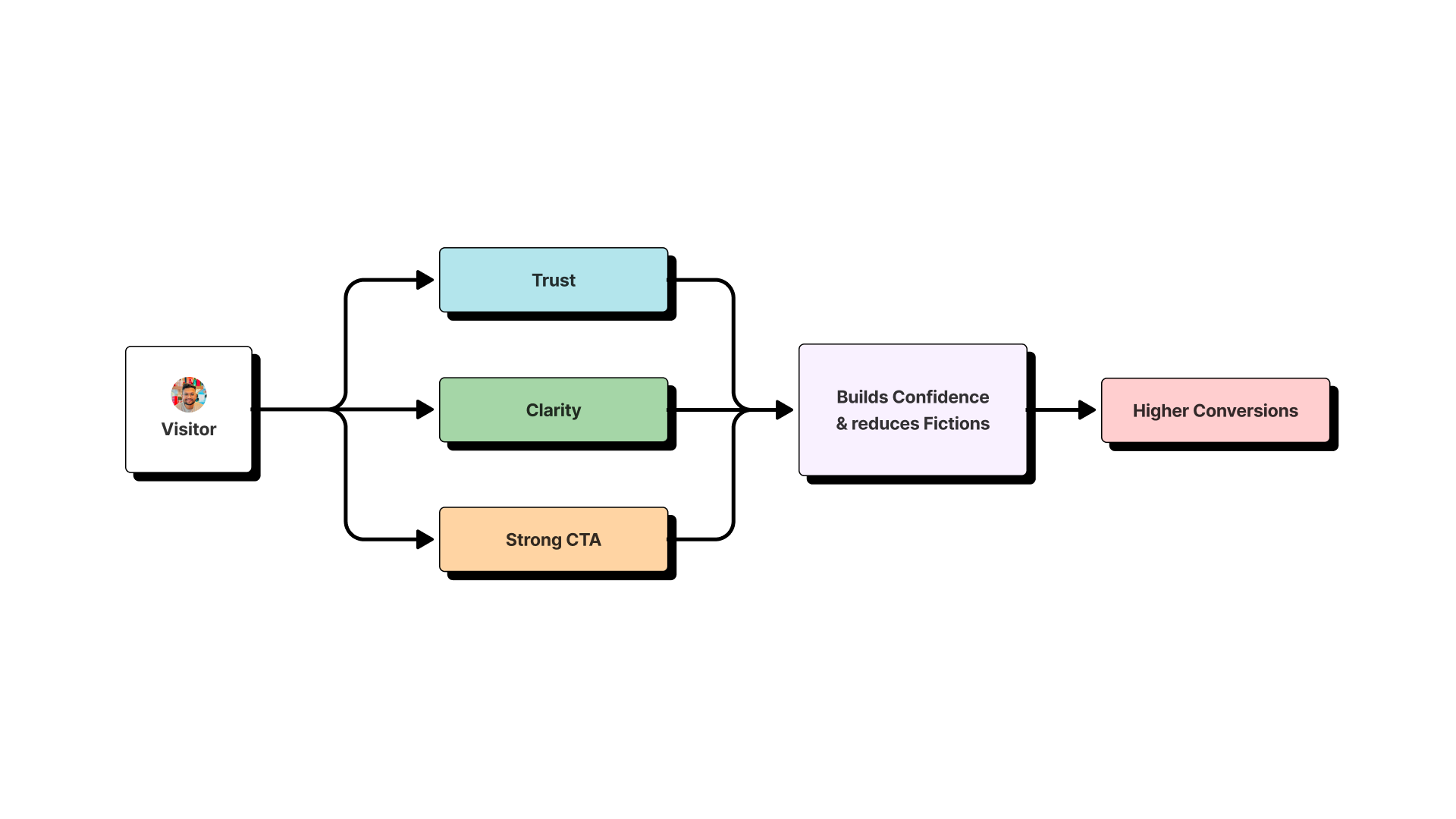
Implementing landing page best practices is the ultimate test for a designer. A landing page has one job: to turn a visitor into a customer. There’s no room for confusion or distraction. As a Lead Digital Designer, I’ve learned that high-converting pages are engineered with strategy and empathy. At SEO Content AI, my data-driven redesign reduced our bounce rate by 40% and increased CTR by 25%.
This isn’t just another list of tips; this is my playbook for creating landing pages that don’t just look good, but actually work.
Key Takeaways from This Guide:
- How to build instant trust with “Message Match.”
- The formula for a headline that solves a user’s problem.
- Why removing distractions is your most important job.
- How to use social proof and powerful CTAs to drive action.
- The technical details, like page speed, that can make or break your conversion rate.
1. Nail the “Message Match”: The Foundation of Trust
The very first question a visitor subconsciously asks when they hit your page is, “Am I in the right place?” Message match is how you answer with a resounding “Yes.” It’s the critical alignment between the ad or link they clicked and the content they see on your landing page. When this connection is seamless, it creates cognitive ease. When it’s broken, it creates immediate friction and suspicion.
During my time at White Label Resell, this was our golden rule. A Google Ad promising “Affordable Tax Prep for Freelancers” led to a page with the headline, “Finally, Stress-Free Tax Prep for Freelancers.” The imagery, language, and offer were all perfectly in sync.
How to Master It:
- Audit Your Funnel: Place your ad and your landing page side-by-side.
- Mirror Keywords: The exact keywords from your ad should appear in your headline.
- Match Imagery and Branding: The visual style must be consistent.
- Echo the Offer: If the ad promises a “Free Ebook,” the words “Free Ebook” should be the most prominent text on the page.
2. Write a Headline That Solves a Problem
Your headline is your one shot to grab a visitor’s attention in under three seconds. Its job isn’t to be clever; its job is to communicate a clear benefit and solve the user’s problem. A great headline enters the conversation already happening in the customer’s mind. If you’re interested in this, I’ve written more about how top designers use cognitive science in UX.
- Vague, Product-Focused Headline: “Introducing ProjectFlow 3.0”
- Clear, Problem-Solving Headline: “Stop Juggling Tabs. Organize Your Entire Workflow in 5 Minutes.”
How to Master It:
- Use the “Benefit + Timeframe” Formula: “[Achieve Desired Outcome] in [Specific, Short Time].”
- Address the Pain Point: “Tired of [Common Frustration]? [Your Solution].”
- Keep it Simple: Avoid jargon. Write like you’re talking to a real person.
3. Design for a Single Goal (and Ruthlessly Remove Everything Else)
A landing page is not your homepage. It’s a hallway with only one door. Every element that doesn’t contribute to that single goal is a potential “leak” in your conversion funnel. The most common and damaging distraction is the main navigation menu.
When I was the Senior Designer for Link Building Blogs, we designed over 300 pages. The moment a user entered a checkout funnel, we removed all exits. The header and footer were stripped of navigation links. It might feel restrictive, but it provides the clarity users need to complete a task.
How to Master It:
- Remove the Main Navigation: This is the most important step.
- Eliminate Competing CTAs: Pick one primary goal per page.
- Simplify the Footer: A link to your Privacy Policy is often all you need.
- Use Visual Hierarchy: Make your primary CTA the undeniable focal point.
4. Show, Don’t Just Tell, with Powerful Social Proof
People trust other people far more than they trust brands. Social proof is your most powerful asset for building credibility and overcoming skepticism. But not all social proof is created equal. The more specific and relatable it is, the more effective it will be.
How to Master It:
- Use Outcome-Oriented Testimonials: Go beyond “Great product!” Ask for specific results. “This tool helped us cut our project management time by 10 hours a week” is infinitely more powerful.
- Display Client Logos: If you’re B2B, a bar of recognizable client logos is instant credibility.
- Showcase Data and Numbers: “Join 50,000+ happy users” is a powerful statement.
- Leverage Case Studies: For high-commitment products, a short summary of a case study can be very persuasive.
5. Make Your CTA the Undeniable Star of the Show
Your Call-to-Action (CTA) button is the climax of your landing page. It needs to be the most visually prominent element. It should be an ethical guidepost, not a trick. In fact, misleading buttons are a common tactic I cover in my article on 10 Dark UX Patterns to avoid.
This was a key lesson from my work on the Scale Of Universe app. Changing a generic “Submit” button to “Add My Discovery to the Universe” was a key factor in increasing app installs by 65%.
How to Master It:
- Color and Contrast: Your button color should stand out from the rest of your page’s color palette.
- Action-Oriented Copy: Start with a verb. Use “Get,” “Start,” or “Reserve.”
- First-Person Language: Test changing “Start Your Free Trial” to “Start My Free Trial.”
- Placement: Place it prominently above the fold and repeat it on longer pages.
6. Keep Your Forms Short, Sweet, and Smart
The form is often the final hurdle. Every field you add increases friction and gives the user another reason to abandon the process.
How to Master It:
- Ask for the Bare Minimum: For a newsletter, you only need an email. Don’t ask for a phone number unless you plan to call them.
- Use Multi-Step Forms: If you need more information, break the form into smaller steps.
- Smart Defaults and Autofill: Make it easy. Use HTML autofill attributes and pre-select options where possible.
7. Use a Hero Shot That Tells a Story
Your hero shot—the main image or video at the top of your page—is not just decoration. Its job is to support your headline and visually communicate the value of your offer. A good hero shot helps the user instantly understand what they’re getting.
How to Master It:
- Show Context: If it’s a software product, show a clean image of the UI in action.
- Evoke Emotion: If it’s a service, use an image of a person experiencing the positive outcome.
- Ensure Quality: Use high-resolution, professional images. Blurry or generic stock photos erode trust.
8. Ensure Lightning-Fast Speed, Especially on Mobile
Page load time is a critical factor for user experience and SEO. A slow page kills conversions before a user even sees your content. In today’s world, this means prioritizing your mobile experience.
How to Master It:
- Test Your Speed: Use tools like Google’s PageSpeed Insights to analyze your page.
- Optimize Images: Compress your images before uploading them.
- Design Mobile-First: Your landing page must be fully responsive and easy to navigate on a small screen.
9. Make Your Offer Clear and Compelling
A great landing page can’t save a bad or unclear offer. Your value proposition must be irresistible. The user needs to feel that what they are getting (a free trial, an ebook, a discount) is far more valuable than the information they are giving you (their name and email).
How to Master It:
- Be Specific: Instead of “Download a Guide,” try “Download Our 50-Point SEO Checklist.”
- Use Bullets: Clearly list the key benefits or takeaways of the offer near the form.
- Reinforce Value: Use phrases like “Get Instant Access” to emphasize the immediacy of the reward.
10. A/B Test Your Way to Success
You can’t improve what you don’t measure. The most successful landing pages are never “finished.” They are constantly evolving based on user data. A/B testing—showing two different versions of a page to different segments of your audience—is the only way to know for sure what works.
My Google Analytics Individual Qualification isn’t just a badge; it’s a testament to a philosophy of data-driven design. If you’re looking to get started, I highly recommend my Ultimate Guide to Google Analytics 4 for UX Designers.
How to Master It:
- Test One Thing at a Time: Test your headline first. Then move to your CTA, hero image, and form design.
- Let it Run: You need a statistically significant amount of traffic to get reliable results.
- Learn from Everything: Even a “failed” test provides valuable insight into what your audience doesn’t respond to.
By embracing these ten principles, you move from being a page decorator to a conversion architect. You create experiences that are clear, empathetic, and incredibly effective at guiding users to a solution—building trust and driving growth, one click at a time.