Hey there, fellow creatives!
As a digital designer, I’ve spent countless hours staring at a screen, knowing a design could be better but not sure where to start. We’ve all been there. You feel stuck, and the idea of a massive redesign is overwhelming.
But what if you didn’t need a complete overhaul?
Over my five-plus years in design, I’ve learned that sometimes, the most significant improvements come from the smallest tweaks. This was especially true when I had to revamp a 32-page website for Wooden Wood Works in just 12 days. A tight deadline forces you to focus on what matters most: clarity, usability, and honest communication.
These aren’t magic bullets, but they are simple, powerful checks you can do in seconds. They’re my go-to moves for turning a good design into a great one.
Let’s dive in.
1. The Squint Test: Find Your Focal Point
This is one of the oldest tricks in the book for a reason. Lean back from your screen and squint your eyes until the design becomes a blurry landscape of shapes and colors.
- What to ask: What’s the one thing that stands out? Is it the thing you want users to see first?
- The 10-Second Fix: If your main call-to-action (CTA) or headline disappears into the blur, it’s not prominent enough. Increase its size, change its color, or give it more breathing room. Your most important element should be obvious even when you can’t see the details.
This simple test instantly reveals whether your visual hierarchy is working for your user or against them.
2. Double the White Space Around One Key Element
When a design feels cluttered or confusing, the problem isn’t usually too much content—it’s not enough space. White space (or negative space) is the single best tool for creating focus and a sense of calm.
- What to ask: Does my most important button or form field feel cramped?
- The 10-Second Fix: Find the most critical element on your page (e.g., “Sign Up,” “Add to Cart”) and double the padding or margin around it. Watch how it immediately draws the eye and feels more important. It’s like putting a frame around a painting.
At SEO Content AI, we used this principle to design a customizable dashboard. By giving key metrics more space, we made the whole interface feel less intimidating and more actionable for users.
3. Make Your Main CTA More Human
A button is a conversation with your user. Too often, we use generic, robotic language like “Submit” or “Click Here.”
- What to ask: Does this button clearly state what will happen when I click it? Does it reflect the user’s goal?
- The 10-Second Fix: Change one word to add value. Instead of “Submit,” try “Get Your Free Quote.” Instead of “Download,” try “Grab My Ebook.”
This is exactly what we did on the Scale Of Universe app. We simplified the submission flow for new terms, making the language more inviting. That small set of changes was a key part of increasing app installs by 65%. It works because it connects the action to the user’s motivation.
4. Check Your Text Contrast—Seriously
This is a non-negotiable for accessibility and usability. Light gray text on a white background might look “clean” and “minimalist,” but if your users can’t read it, your design has failed.
- What to ask: Can someone with less-than-perfect vision read this easily?
- The 10-Second Fix: Use a free contrast checker tool online to test your primary text and background colors. If it fails, darken your text. It’s that simple. You’ll make your design more inclusive and easier for everyone to read.
5. Remove One Unnecessary Detail
Great design is often about what you take away. Every element on a page adds cognitive load—the amount of brainpower required to use it.
- What to ask: Does this line, icon, or extra form field truly need to be here? Does it serve a purpose, or is it just decoration?
- The 10-Second Fix: Find one thing to delete. It could be a decorative divider line, an optional form field, or a social icon that no one clicks. Removing it will almost always make the remaining elements stronger.
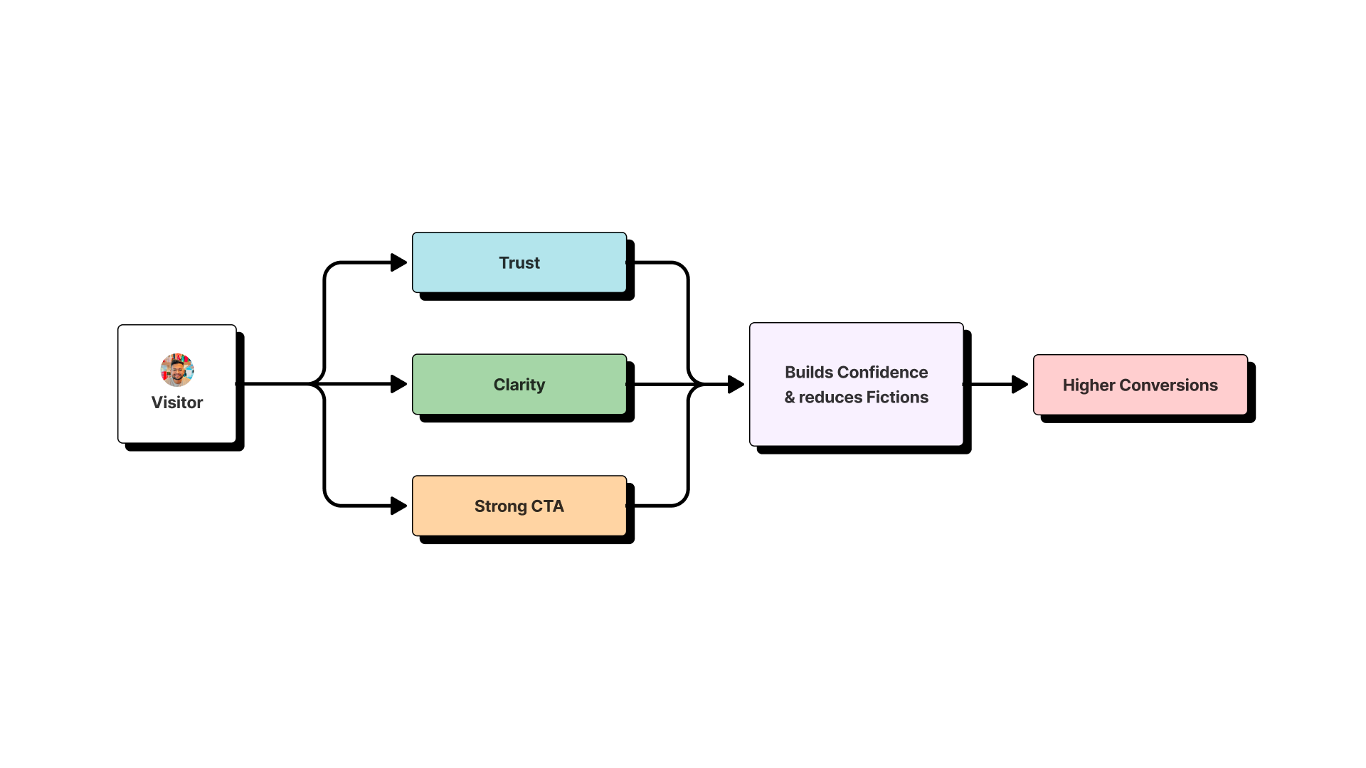
Why This Matters
These tiny fixes might seem basic, but they are the foundation of a human-centered design approach. They build trust, reduce friction, and create clarity.
At SEO Content AI, applying these principles of clarity and focus helped us reduce our bounce rate by 40%. Small, intentional changes compound. They show users that you respect their time and attention.
The goal isn’t just to make things pretty; it’s to make them work better for people. So next time you’re stuck, don’t aim for a revolution. Start with a 10-second fix.