Maybe you accidentally signed up for a subscription you didn’t want, paid hidden fees, or struggled to cancel a service.
As a Digital Designer, I’ve seen first-hand how these frustrating experiences aren’t accidents.
They’re often the result of dark patterns, deceptive design tactics that manipulate users into actions they didn’t intend to take.
For UI/UX designers and business owners, dark patterns can feel like a tempting shortcut to boost metrics like sign-ups, sales, or engagement.
But while they might deliver short-term wins, they erode trust, damage brand reputation, and even lead to legal trouble.
In this post, we’ll dive into the top dark patterns, how they “work,” and why ethical design is the only sustainable path forward.
What Are Dark Patterns?
Coined by UX expert Harry Brignull in 2010, dark patterns are intentionally confusing or manipulative design elements that exploit human psychology.
They prey on cognitive biases — like urgency, fear of missing out (FOMO), or decision fatigue — to nudge users toward choices that benefit the business, often at the user’s expense.
For example, a “free trial” that requires a credit card and silently converts into a paid subscription, or a checkout page that hides extra fees until the final step.
These tactics are everywhere: a Princeton University study found that 10% of popular e-commerce sites use dark patterns, while the European Commission reported that 97% of apps employ them.
Top 10 UX Dark Patterns (And Why They’re Problematic)
Let’s break down the most common dark patterns, their real-world examples, and why they’re harmful — even if they seem profitable.
1. Roach Motel
- What it is: Easy to get into, impossible to escape. Think: signing up for a service in two clicks but needing a PhD to cancel.
- Example: Amazon Prime’s infamous cancellation process, which requires navigating multiple pages filled with distractions like “You’ll lose Prime Video!” prompts.
- Why it’s toxic: Users feel trapped, leading to resentment and chargebacks. The FTC recently fined Amazon $25 million over this practice.

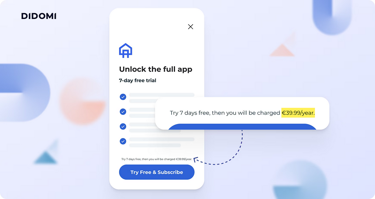
2. Forced Continuity
- What it is: Free trials that auto-renew into paid subscriptions without clear warnings.
- Example: Fitness apps that demand credit card details for a “7-day free trial” but charge $99/year if you forget to cancel.
- Why it’s toxic: Surprise charges breed distrust. Adobe faced backlash for automatically enrolling users in annual plans with hefty cancellation fees.
3. Hidden Costs
- What it is: Adding fees (shipping, taxes, service charges) only at checkout.
- Example: Ticketmaster’s notorious “service fees,” which can double the ticket price.
- Why it’s toxic: Users feel deceived. GameStop faced a $5 million class-action lawsuit for charging hidden shipping fees.

4. Bait and Switch
- What it is: Promising one thing but delivering another.
- Example: Microsoft’s Windows 10 update pop-up, where clicking the “X” to close it started the update instead.
- Why it’s toxic: Users lose faith in the brand’s integrity.
5. Privacy Zuckering
- What it is: Tricking users into sharing more data than they intended. Named after Facebook’s Mark Zuckerberg.
- Example: Social platforms that default privacy settings to “public” or bury opt-out options in menus.
- Why it’s toxic: Violates GDPR and erodes trust. Google paid $93 million for hiding location-tracking settings.
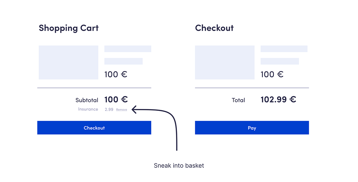
6. Sneak into Basket
- What it is: Adding unwanted items to your cart (e.g., travel insurance).
- Example: Airlines like Ryanair auto-select add-ons during checkout.
- Why it’s toxic: Users feel nickel-and-dimed.
7. Confirmshaming
- What it is: Guilt-tripping users into opting in.
- Example: Pop-ups saying, “No, I don’t want to save money” to decline a discount.
- Why it’s toxic: Emotional manipulation drives users away.

8. Misdirection
- What it is: Highlighting a “deal” while burying restrictions.
- Example: Airlines advertising $99 flights but hiding baggage fees in tiny text.
- Why it’s toxic: Users associate your brand with dishonesty.
9. Fake Urgency
- What it is: “Only 1 left!” countdown timers that reset endlessly.
- Example: Fashion retailers like Select Blinds fined $10 million for fake scarcity tactics.
- Why it’s toxic: Short-term sales, long-term skepticism.

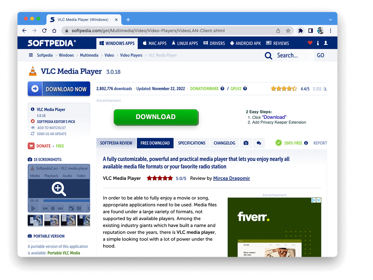
10. Disguised Ads
- What it is: Ads masquerading as content (e.g., fake “Download” buttons).
- Example: Software sites with “Download Now” links that trigger adware .
- Why it’s toxic: Users associate your brand with malware.
Why Businesses Use Dark Patterns
Dark patterns persist because they work — for a while.
A/B testing often shows that manipulative designs increase sign-ups or sales by 10–20%.
For example:
- Pre-checked boxes: Users are 30% more likely to opt into newsletters or add-ons.
- Auto-renewals: Subscriptions with “hidden” renewals see 50% lower cancellation rates.
But these gains are illusory. Studies show that 60% of users abandon brands after a negative experience, and regulators are cracking down.
Ethical Alternatives: How to Win Without Trickery
Here’s how to build trust and profit:
1. Transparent Pricing
Show all costs upfront. Airbnb’s “total price” toggle, which includes fees, increased bookings by 15%.
2. Easy Opt-Outs
Make unsubscribing as simple as subscribing. Spotify’s one-click cancellation boosted retention by reducing frustration.
3. Honest Urgency
Use real scarcity (e.g., “Last 2 tickets at this price!”) instead of fake timers. Patagonia’s “Buy Less” campaign increased sales by aligning with customer values.
4. Respect Privacy
Default to minimal data collection. Apple’s App Tracking Transparency boosted iPhone sales by 34% in 2021.
5. User Centered Design
Audit your UX for dark patterns. Tools like Fair Patterns help replace deception with ethical interfaces.
What’s Next?🎓
Thank you for reading until the end. Before you go:
- Please consider clapping and following the writer! 👏
- Follow us X | LinkedIn | YouTube | Discord |
- Looking for a UX Audit — Himanshuraikwar.com