Have you ever looked at a headline and felt that something was just a little… off? The letters might be spelled correctly, but the spacing feels awkward and unbalanced. That feeling is often caused by poor kerning—the process of adjusting the space between individual pairs of letters to create a visually pleasing and readable result.
Kerning is the invisible art of typography. While tracking adjusts the spacing for a whole block of text uniformly, kerning is the meticulous, character-by-character adjustment. Think of it like arranging people for a group photo. You wouldn’t leave the same amount of space between every person; you’d nudge people closer or further apart to create a balanced composition. That’s exactly what kerning does for letters.
As a Lead Digital Designer, I’ve seen firsthand how this small detail can have a massive impact. It’s one of the most effective quick fixes to improve UI design, elevating a project from looking amateurish to professional. Let’s dive into why this subtle art is so critical for modern UI design.
Why Kerning is Crucial in UI Design
Good kerning is like good lighting in a film—you don’t notice it when it’s done well, but you definitely notice when it’s done poorly. Here’s how it directly impacts the user experience.
1. It Dramatically Improves Readability
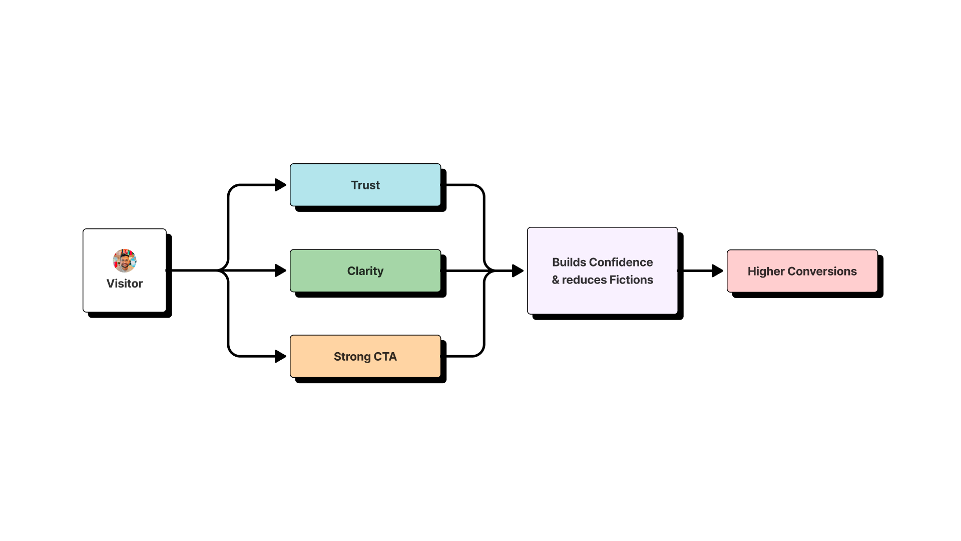
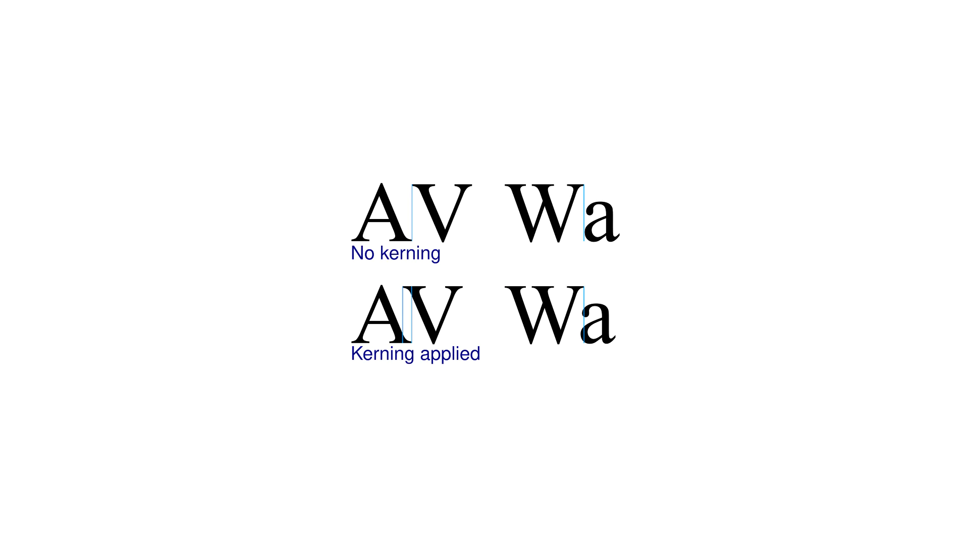
The primary goal of text is to be read. Poor kerning creates awkward gaps or crowded collisions between letters, forcing the user’s brain to work harder to recognize words. For example, the letters ‘A’ and ‘V’ naturally have a large gap between them. Without proper kerning to tuck them closer together, the word “AVATAR” can almost look like two separate words.
By adjusting these spaces, you create a smooth, rhythmic flow that allows the user’s eye to move effortlessly across the text. This principle of readability is crucial not just on traditional screens, but becomes even more critical in emerging fields like AR shopping, where text must be clear against complex real-world backgrounds.
2. It Creates a Professional and Polished Aesthetic
Attention to detail is a hallmark of quality. When users see perfectly spaced headlines and buttons, they subconsciously associate that polish with the quality of the product itself. It builds trust.
I learned this lesson while designing the branding for a client at White Label Resell. The initial logo draft had default letter-spacing, and the client felt it “lacked authority.” By manually kerning the letters in the company name, particularly around the ‘W’ and ‘A’, the logo instantly felt more solid, balanced, and intentional. That small change made all the difference in perceived professionalism.
3. It Enhances Visual Hierarchy
In UI design, you use size, weight, and color to guide the user’s eye. Kerning is another tool in that arsenal. Tighter, more controlled kerning on a headline can make it feel more compact and impactful, setting it apart from the more loosely spaced body copy below. This subtle distinction reinforces the visual hierarchy and helps users process information more efficiently.
When to Pay Close Attention to Kerning
You don’t need to manually kern every single word on a page. Modern design software and fonts come with hundreds of built-in “kerning pairs” (like “To”, “Wa”, “P.”). For those looking to dive deeper, resources like Adobe’s guide on kerning offer a technical look at how these pairs work.
However, there are specific situations in UI design where you should always check and adjust the kerning:
- Headlines and Large Display Text (H1, H2): The larger the text, the more obvious spacing issues become.
- Buttons and CTAs: The text on a button needs to be perfectly balanced and easy to read in a split second.
- Logos and Brand Marks: A logo is permanent. Its kerning must be flawless.
- Data Visualizations: When displaying numbers or short labels in charts and graphs, clear spacing is essential for accurate data interpretation.
A Quick Tip: Practice Makes Perfect
The best way to develop an eye for kerning is to practice. There are fun, browser-based games like Kern Type that challenge you to fix poorly kerned words. Spending just a few minutes on a game like this can train your eye to spot spacing issues much faster in your own work.
Conclusion: The Small Detail That Makes a Big Difference
Kerning is more than just a technical tweak; it’s an act of empathy for your user. It’s about removing unnecessary friction and presenting information in the clearest, most professional way possible. This focus on the user’s cognitive experience is a core tenet of ethical design, whether we’re adjusting letter-spacing or considering the profound ethical challenges of new technologies like brain-computer interfaces.
By mastering this subtle skill, you can significantly improve the readability, aesthetics, and overall user experience of your designs, building trust and credibility one letter-space at a time.