
Design Challenge · Senior Product Designer
AiSensy Checkout & Onboarding Redesign
Simplifying complex decision-making and optimizing the path to purchase
- Project
- Design Challenge
- Role
- Product Designer
- Expected Impact
- Optimized Activation
Before
After
Project Brief
As part of the evaluation for the **Senior Product Designer** role, I was tasked with redesigning the AiSensy checkout experience. The goal was to transform a complex, modal-heavy journey into an intuitive, high-converting flow.
Core Objectives
- ✓ Simplify decision-making and user flow
- ✓ Establish clear visual hierarchy for plans & add-ons
- ✓ Ensure mobile responsiveness & smooth interactions
- ✓ Increase purchase completion rates
My solution focuses on **progressive disclosure**—moving away from overwhelming modals to a dedicated, step-based checkout page that guides users through plan selection, customization, and final review.
Target Activation
High
Focus Area
Checkout
The Challenge
The existing onboarding and early product experience introduced several usability issues that made it difficult for new users to understand and activate the platform.
Key issues identified during the audit:
- Fragmented entry paths causing decision paralysis
- Value communication disconnected from operational actions
- Immediate interruptions (popups) before user orientation
- Checkout complexity exceeding modal constraints
- Repetitive upgrade pressure without outcome framing
These problems increased cognitive load and slowed down product activation, leading to higher churn during the critical first 24 hours.
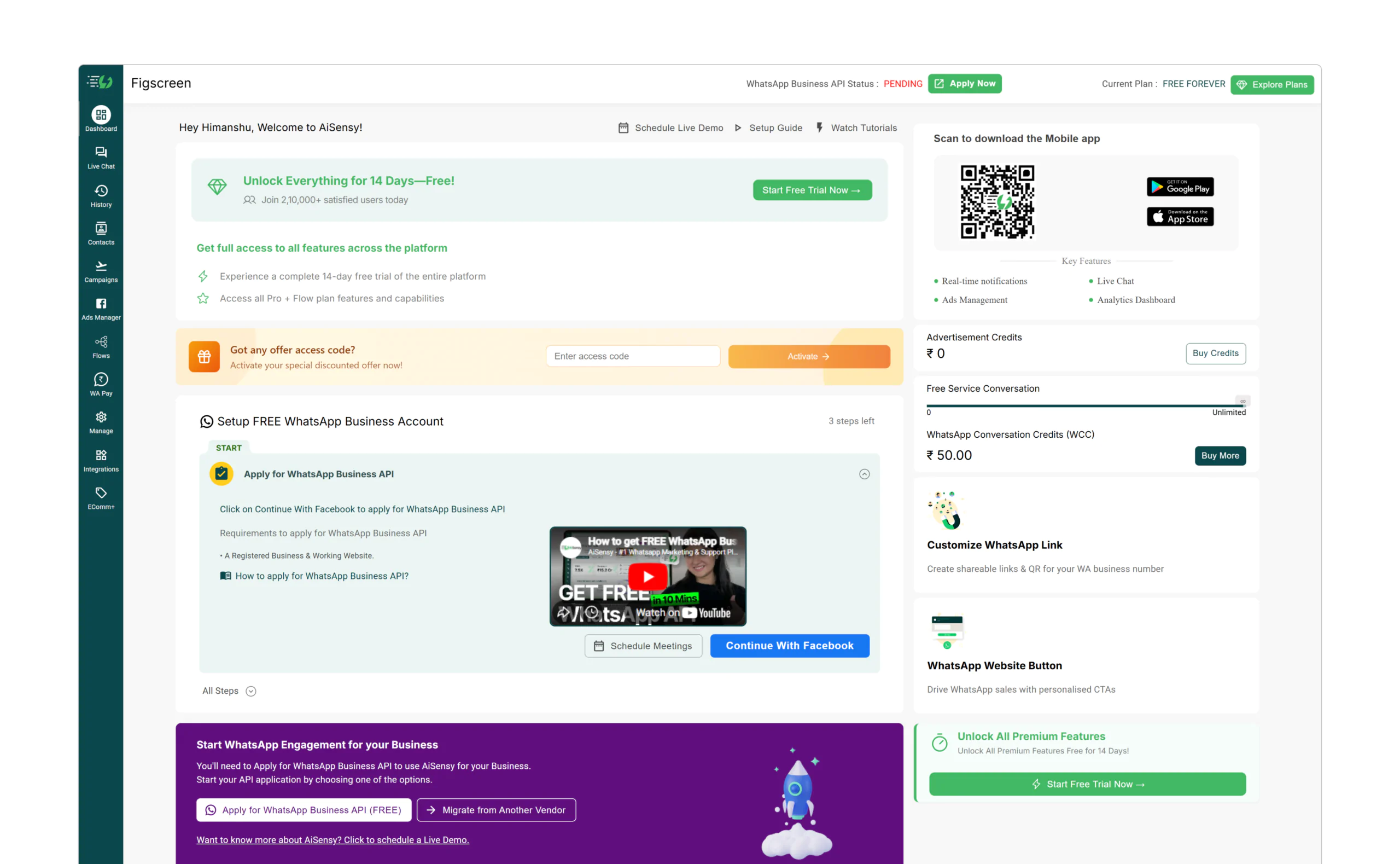
Initial audit of the legacy dashboard revealed high cognitive load and unclear hierarchy.
Deep-dive UX Audit
To understand the "why" behind user drop-offs, I conducted a screen-by-screen audit of the entire flow. This research revealed critical gaps in trust, continuity, and decision-making.
Account Creation
UX Gap
Friction-heavy signup with multiple fields. Lack of trust indicators during the first touchpoint.
Opportunity
Prioritize Social Login (Google) and add social proof to reduce perceived risk.
Signup Experience
UX Gap
Value proposition is hidden behind a wall of inputs. Users aren't sure what they are signing up for.
Opportunity
Use progressive disclosure. Show product value alongside the signup form.
OTP Verification
UX Gap
Verification screen breaks visual continuity. Submit CTA appears disabled without explanation.
Opportunity
Maintain visual consistency and improve 'Resend' UX with clear countdowns.
Dashboard Entry
UX Gap
Immediate popup interruption before user orientation. Adds cognitive load too early.
Opportunity
Delay feature discovery until after first successful action. Use non-blocking patterns.
Checkout Experience
UX Gap
Complex decisions (billing, add-ons) forced into a constrained modal.
Opportunity
Move checkout to a dedicated page for clear hierarchy and progressive disclosure.
Post-Trial State
UX Gap
Trial status is visible but not actionable. Repetitive upgrade CTAs create pressure.
Opportunity
Focus messaging on outcomes achieved during trial, not just a countdown timer.
The "Why" Behind the Redesign
The audit proved that the product was asking for too much effort too early. By mapping these gaps, I was able to prioritize changes that directly impacted activation: simplifying the entry, clarifying the trial, and moving complex decisions to dedicated spaces.
Simplified signup
The signup experience was redesigned to reduce friction and communicate value clearly.
Key improvements:
- Google login prioritized for faster entry
- Minimal required fields
- Clear value messaging before action
- Trust indicators included
OTP verification
Users verify their WhatsApp number through OTP to enable messaging functionality.
Progressive onboarding
The onboarding flow was redesigned into smaller, structured steps to reduce overwhelm.
Trial experience
A dedicated trial experience was introduced to clearly communicate the user’s state.
Optimizing the Purchase Path
The core of the assignment was to fix the checkout experience. I moved from a "stacked modal" approach to a **dedicated checkout page** to provide the space needed for complex decisions.
Design Rationale
1. Visual Hierarchy
Used distinct card elevations and primary button placement to make the 'Pro' plan the clear recommendation.
2. Simplified Add-ons
Separated plan selection from add-on configuration to prevent cognitive overload.
3. Mobile-First Flow
Designed a single-column stack for mobile with a sticky 'Order Summary'.
Hypothesized Outcome
"By moving checkout to a dedicated page, the goal is to reduce cognitive load and eliminate the 'Modal Fatigue' that often leads to drop-offs."
Post-payment experience
After completing the purchase, users are immediately greeted with an activation state that confirms their new plan.
Dashboard experience
The final dashboard experience was redesigned to guide users toward meaningful actions and provide a clear overview of their marketing performance.
Measuring Success
As this is a design challenge, the following metrics represent the **hypothesized outcomes** I would track post-launch to validate the redesign.
Trial Activation Rate
Tracking users who complete the "Aha!" moment within 24 hours.
Time-to-Value (TTV)
Measuring the speed at which users set up their first campaign.
Checkout Completion Rate
Monitoring the funnel from plan selection to successful payment.
Design Philosophy
1. Clarity over Clutter: In a complex B2B tool, the designer's job is to be a filter. I focused on showing only what the user needs.
2. Intentional Friction: Sometimes, slowing a user down to confirm a choice is better than a fast but confusing checkout.
3. Data-Informed Iteration: If this were a live project, I would use A/B testing to find the optimal balance.